Categories:
Choosing fonts: What font should I use for my book?

When you publish a book, you are creating a brand. Every decision you make when developing your book should relate to the brand you want to create.
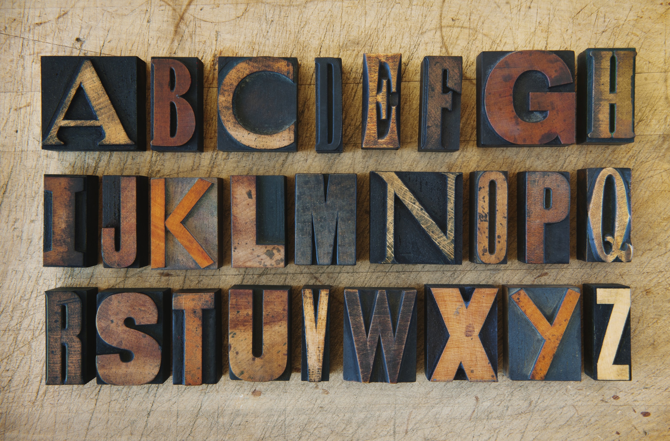
Choosing fonts for your book is important for establishing its tone. Many amateur authors make the same common mistake when designing the interior of their book — they choose the wrong font.
Fonts and formatting
When designing the covers and interior of a book, it can be easy to get swept up in all the fancy and creative fonts as there are thousands to choose from.
With ebooks becoming so popular, formatting your book for digital devices is essential. Some fonts look better in print while others are better for e-books. Thankfully, some tried and true fonts work for both so you don’t have to format your book multiple times.
Fonts for ebooks
In 2007 Amazon released the Kindle and launched the e-book industry. Now it is much easier for new authors to self-publish and sell their products in the digital world.
It’s important to pick one simple font for an ebook. A fancy font can end up getting translated into weird characters on some devices. Also, since digital devices are using pixels, you should avoid fonts that require a lot of them. Here’s a list of 10 popular fonts for e-books:
- Roboto
- Open Sans
- Lato
- Slabo 27px
- Oswald
- Roboto Condensed
- Source Sans Pro
- Montserrat
- Raleway
- PT Sans
Fonts for print
With printed books, you don’t need to worry about pixels or character translation. Different fonts can serve different purposes. The following fonts work great for setting the tone of your book:
- Baskerville: Good for literary fiction.
- Sabon: Perfect for romanic fiction.
- Garamond: Very popular with thrillers.
- Caslon: Good for non-fiction works.
- Utopia: Great for general interest books.
If you want a font that can crossover from print to ebook, try one of these:
- Helvetica
- Arial
- Courier New
- Verdana
Choosing fonts
The fonts you choose should flow from the cover to the interior of the book. To maintain reader engagement, your font should represent the material and genre. Also, when choosing the right font you should keep these few tips in mind:
- Versatility: Your book will likely use different typefaces throughout. Your font should flow well in regular, bold, and italic. It should also be a good crossover font if you intend to publish on multiple platforms.
- Distracting: Avoid fonts that are obtrusive and distractive. Fancy, stylish fonts can cause a reader to lose interest.
- Legibility: Books are printed in different sizes. A hardback book has a larger font than a paperback. Make sure the font you choose is just as easy to read on a smaller scale.
Palmetto Publishing has knowledgeable and experienced staff members available to assist you in every aspect of self-publishing your book. Plus, when you use our services, you will maintain 100% creative control of your work.
For more information, schedule a time to chat with one of our friendly professionals.
Related Articles

Blog
The Benefits of Having Different Formats of Your Book Available
Few things are as exciting to an author as holding their finished book for the first time. But what style should it be? Paperback…

Blog
How To Make Your Book Look Professional
When it comes to self-publishing your book, the devil is in the details. Completing your manuscript is a huge accomplishment worth celebrating, but don't…

Blog
Formatting Options: What’s Right For My Book?
Once you have looked at printing cost versus retail cost, taking a close look at your genre and similar titles is an excellent next…

